It was nearly two years ago that I ventured into a world quite unknown to me. Having lived a very sheltered life, I was surprised how quickly I was seduced by a world driven by “Benjamin”. In Benjamin’s world, I quickly became intrigued by his fifty shades of grey.
There were, perhaps, more than 50 shades in his portfolio, definitely much Moore 🙂 Captivated with all the colours in the Benjamin Moore collection, I quickly turned my inexperience in decor to something that I enjoyed doing on a regular basis.
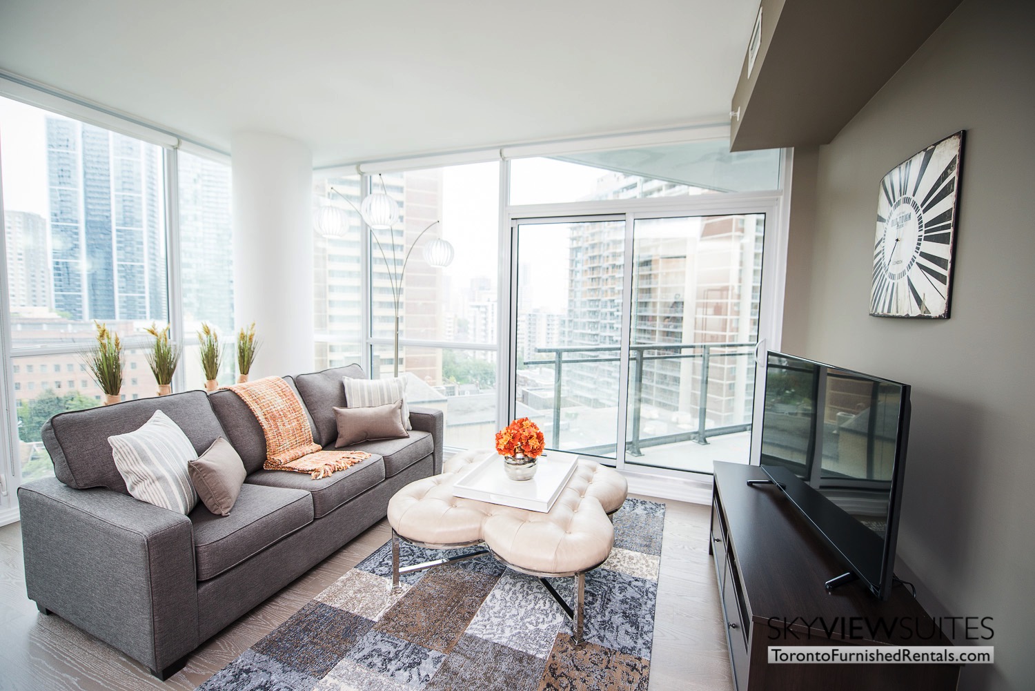
With so many colours to choose from in the Benjamin Moore collection, one might ask: why just grey? It all started with the types of decor projects that I was involved in, catering to the furnished urban rental market in Toronto. Grey was safe and neutral colour and would never offend or overpower a guest in one of our short term furnished rentals.
At first I thought that greys could only be used in “cooler” room settings. In rooms where there were darker finishes, black and white appliances and cabinetry, countertops, etc. I tried to avoid suites that had “warmer” finishes (honey coloured flooring and cabinetry) because I thought I would be stepping out of my grey comfort zone. To my surprise, Benjamin Moore offered a lot of variety; some of the greys had warm hues that allowed me to use them in suites outside of my comfort level. The result, confidence in tackling any condo decor project in the Toronto furnished rental market.
Of course a girl has favourites, and one of my favourite greys is the Dior Grey. The colour is as sophisticated as it sounds and with a small hint of mauve and its deep colour, it always adds drama to any suite. The Dior Grey was boldly used throughout the Hudson suite and the results were dramatic. As would any lover of the Dior Grey, I tried to push this colour choice to a lot of people. When I found that there was hesitation to how dark it was, Pigeon Grey was often a good alternative. It had the same mauve hues, but in a lighter colour. We used Pigeon Grey in our Cinema A suite.
I quickly became comfortable with Elephant Grey, with a slight hint of mocha and mauve, it gave me an opportunity to work on suites that had more honey-coloured and natural wood finishes. With its light wood cabinetry and cocoa coloured stone backsplashes and countertops, the Elephant Grey was a perfect colour choice to paint throughout our Cinema B suite.
Sometimes I found that I had projects that had both warm and cool tones that I had to work with. As a result, I needed to choose greys that teetered into both worlds. As a result, I found that I liked using Granite from Benjamin Moore’s Affinity collection. Sometimes I would use it throughout an entire suite and sometimes I would use it as an accent wall colour and then topped off the rest of the suite with Nightingale (also from the Affinity collection), as can be found in our Urban F and Empire B projects.
When I started discovering the appeal of wallpapers, at times I was forced to choose colours that would work with the wallpaper. Again, I was pulled out of my comfort zone, only to find more exciting colours to fall in love with. The biggest discover was Metallic Silver. I used it in our Signature Three project, specifically in the master bedroom. When I walked into the finished room for the first time, the walls shimmered and I felt like I had just walked into our most glamorous furnished suite yet.
The list of greys continue and I could have easily used much more than 50 shades of grey among our portfolio of suites. I would hope more people will have an opportunity to fall in love with Benjamin Moore like I did and become charmed by his “50+ Shades of Grey”.